8 Principles Of Design and How To Incorporate Them In Your Landscaping

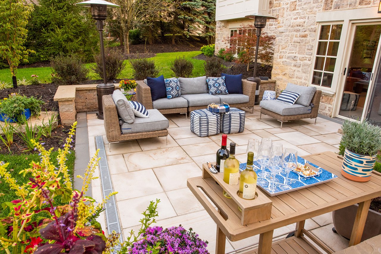
1. Unity- Unity refers to the use of elements that support each other and work well together. Each piece of the design should look as though it belongs with the others. To achieve this you can use similar colors, shapes, or textures.
2. Balance- Balance goes hand in hand with unity. Not a single space in your design should overpower the rest. Focal points can be used, but should still help to keep the space balanced.
3. Contrast and Harmony – Color, texture, height, size, and shape can and should vary throughout the design, providing the eye with different areas of interest. When using contrast however, you must ensure that each piece fits together helping to stick with an overall theme for the design.
4. Color – By using color effectively you can add dimension to your design. The use of bright colors can make an object appear closer, whereas cooler colors can make an object visually appear farther away. By using plants or objects with varying colors, you can add depth to your landscaping.
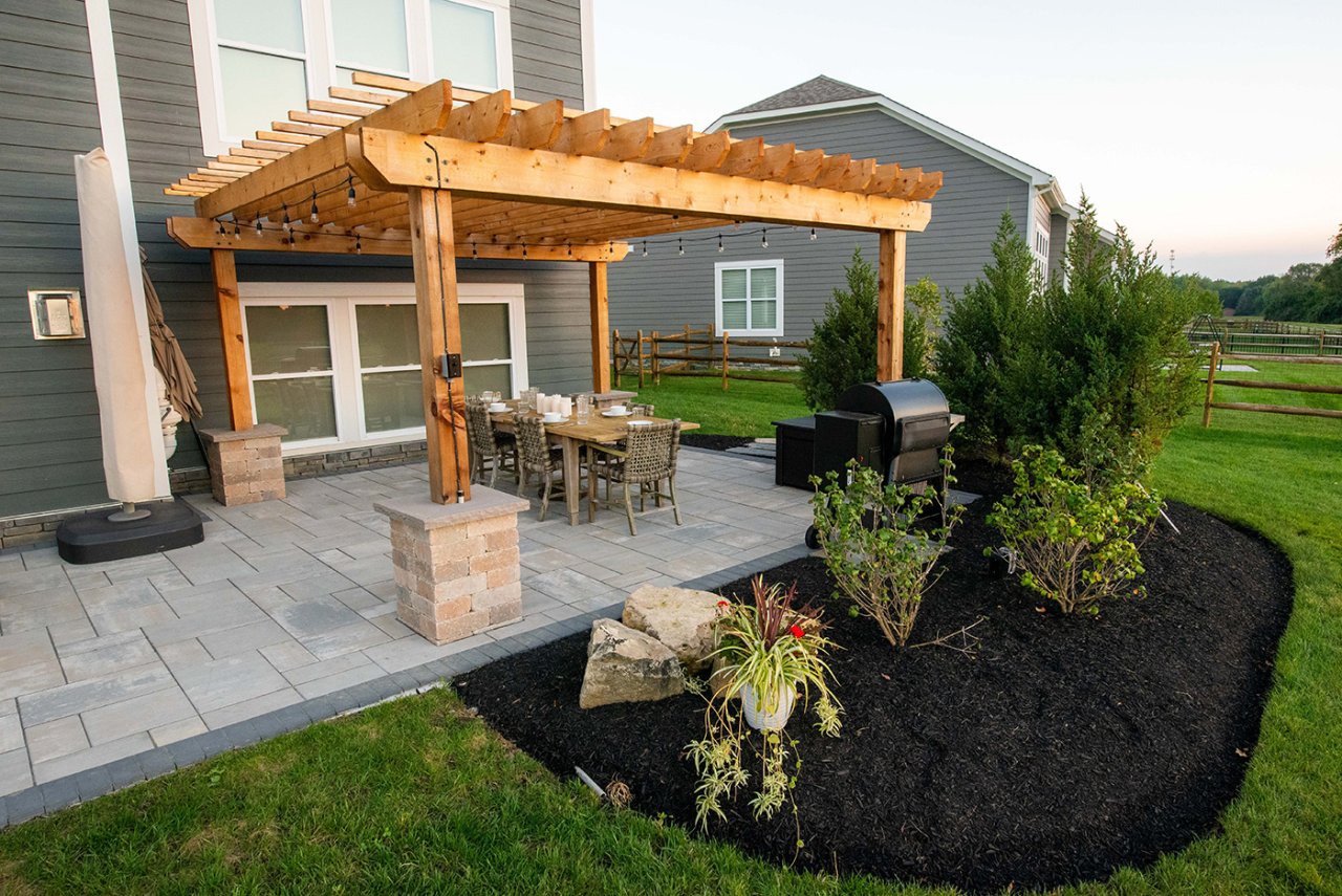
5. Transition – Transition is defined as a gradual change, whether that be in the height – going from tall to short, texture – smooth to rough, size – big to small, or shape - moving from squares to circles. The right transition can make your landscape seamlessly flow from one area to the next while providing a visual interest. Just remember that this does not only apply to planted material, but also hardscaping, such as moving from a deck to a patio.
6. Line – Lines play a pivotal role in all landscape designs. Lines can be curved, straight, vertical, or horizontal each one providing a different effect. Straight lines are direct and forceful where curvy lines give a natural and whimsical vibe. Horizontal lines offer a sense of stability and peace compared to the sense of strength and movement that vertical lines provide. Depending on how you envision using your space and how you want to feel in it will give you an idea on which type of lines to incorporate throughout the design.
7. Proportion – Proportion is related to the size of the elements that surround each other. For example, a walkway needs to fit with the size of the house, a patio needs to look like it belongs, and plants or décor should compliment, not overpower, the surrounding area. Sometimes this can be tricky to envision. When designing landscaping, you should draw everything to scale. This way you can ensure the new pieces will fit the current footprint. For this reason we render 2D or 3D drawings of all of our hardscaping projects and present them to you before we ever start a project.
8. Repetition –While it is good to have variety in your garden, too many unrelated objects will make a garden look cluttered and unplanned. Yet, too much of one plant or object will make your landscape feel boring and unattractive. However, using several different elements repeatedly can create unity and keep the area interesting.

